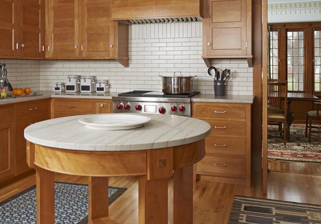
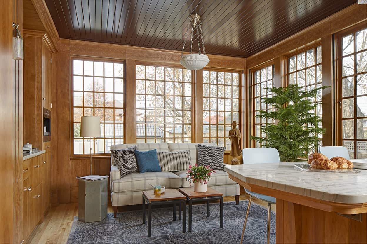
The owners wanted to create a period-appropriate kitchen analogous to the entire house renovation. The kitchen not only needed to be larger, it also needed to afford for future family growth. Our design solution functions in two different ways—currently, the space adjacent to the kitchen is a small family room with an eat-in kitchen peninsula, which can transform into a separate breakfast room once additional casual dining space is needed.
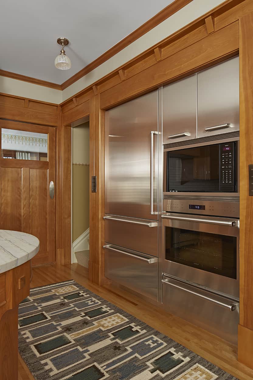
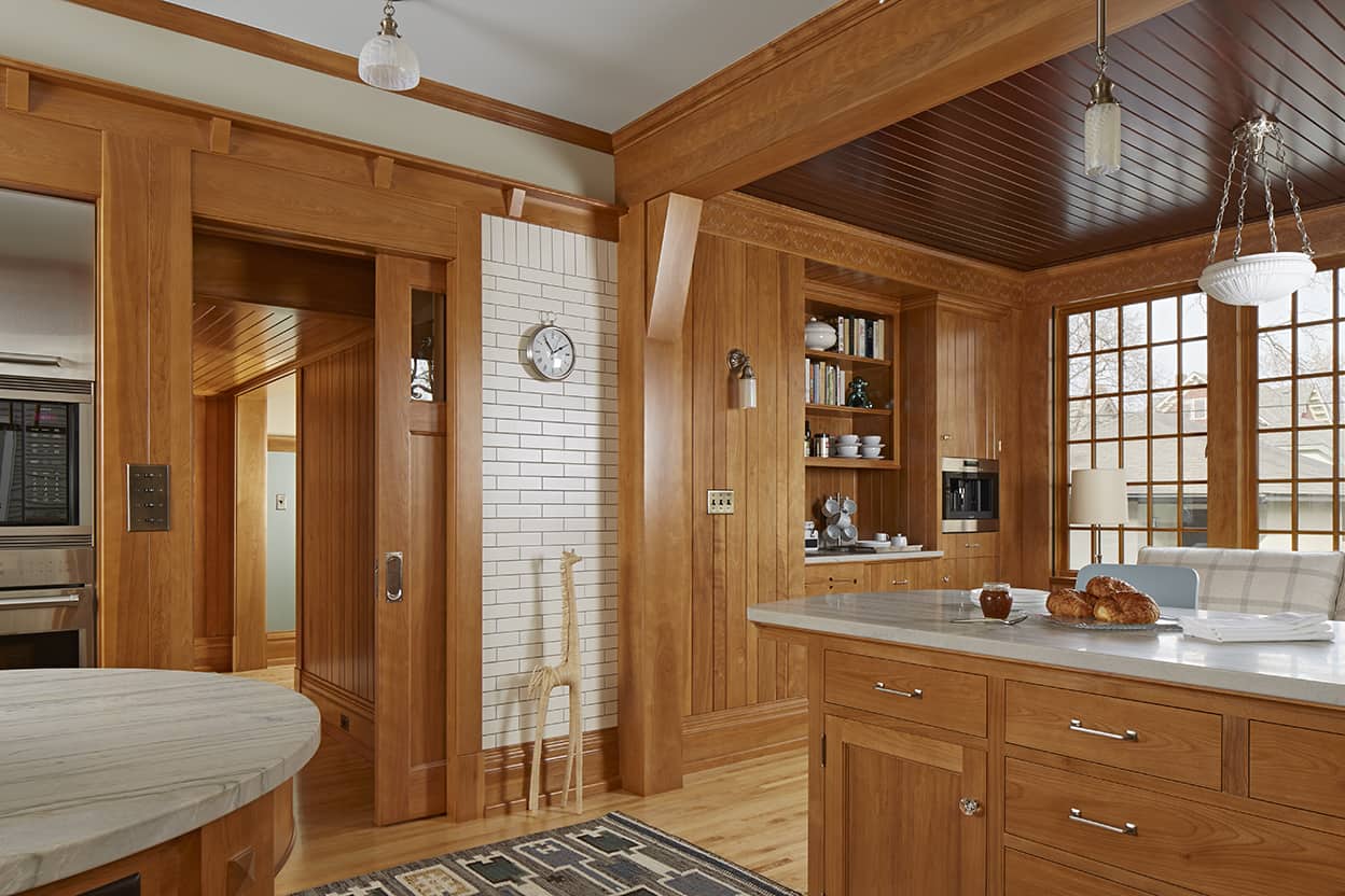
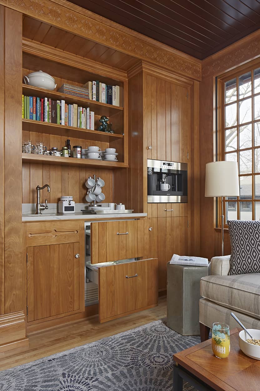
The clients are avid coffee drinkers, and a built-in coffee maker is only one of many appliances we introduced. The quantity of appliances affected the layout of the kitchen and drove the design in many ways. Within the historically appropriate cabinetry we created a stainless steel appliance alcove, so each aesthetic is present but one does not overwhelm the other.
Passed from owner to owner, original drawings of the building presented an interesting dynamic to the design process. We had all the information necessary to rebuild the kitchen as it originally was, yet that wasn’t what we’d been asked to do. It did raise the question; just how and how far should we take things? For instance, we knew the original wood species of the back of house was red birch; this immediately became a part of the central design.
Our designers share their thoughts about our project, including what makes it award-winning.
What’s the background on this project and what were the homeowners’ top design goals?
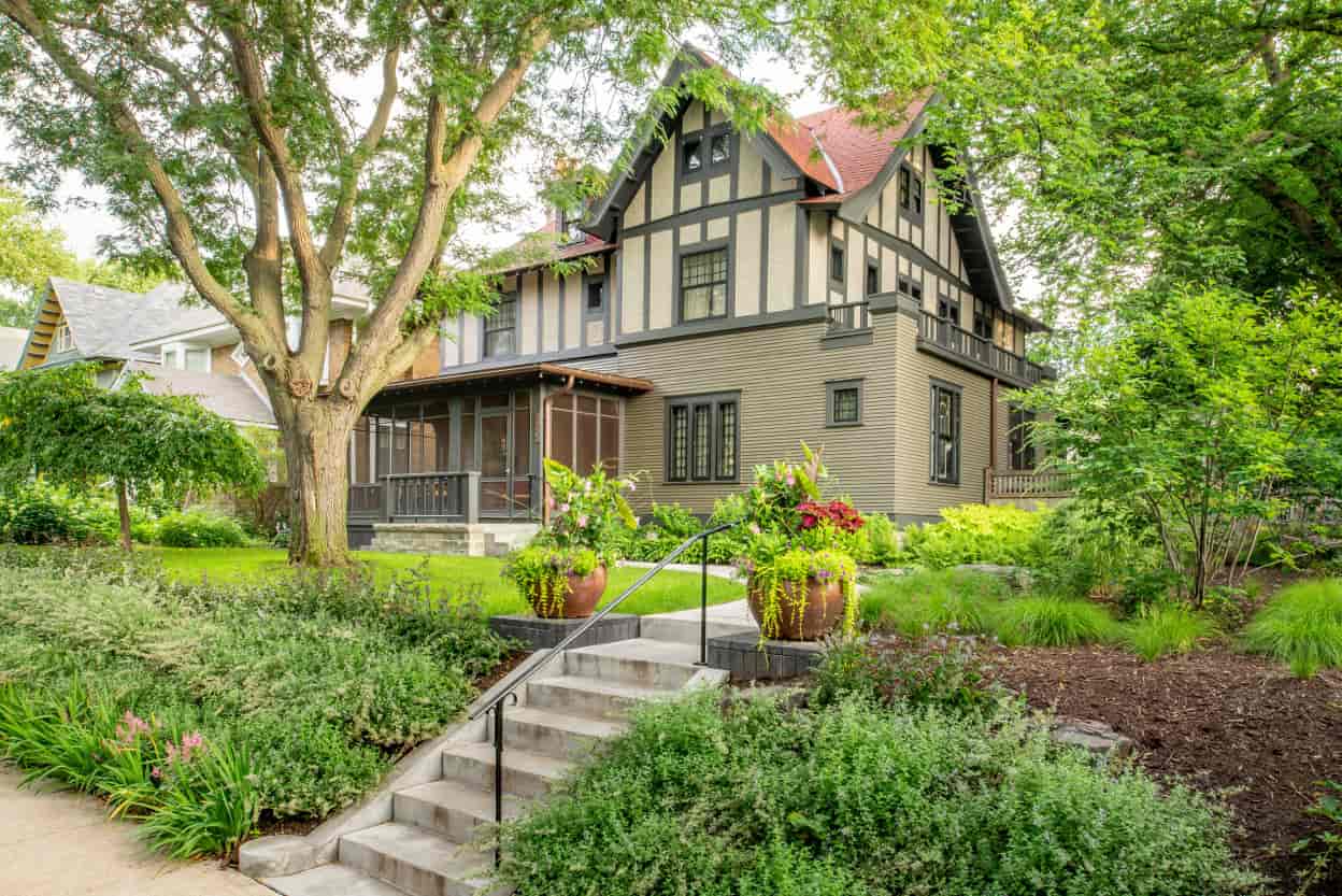
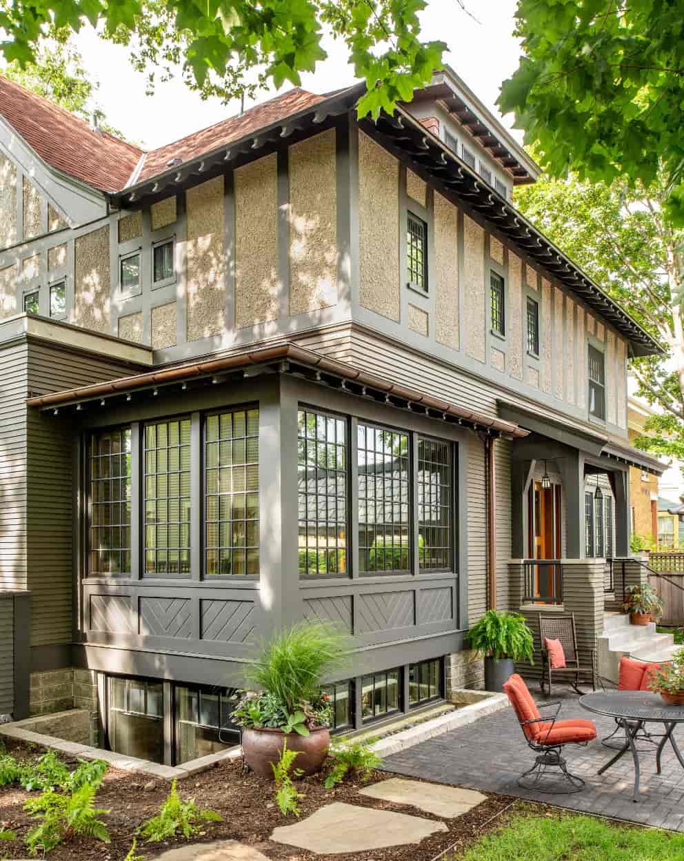
As a boy, our client’s best friend lived in a big old house in historic Saint Paul. When our client and his wife, along with their young son, moved back to Saint Paul a couple years ago, they found that same house for sale. Built in 1907, the Tudor was largely intact but needed maintenance and updates. They purchased the house and set about a project which entailed a complete house restoration and renovation, including replacing a 1970s kitchen with something more period appropriate.
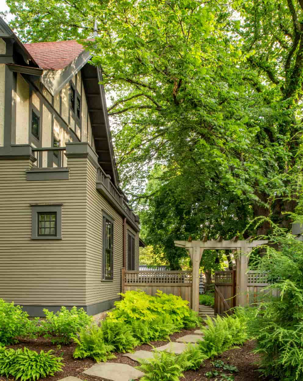
The kitchen needed to be larger to accommodate family and friends, and include an adjacent space for hanging out. While fitting aesthetically within the historic context, the kitchen needed to be functional for a modern lifestyle. The backyard is beautifully landscaped complete with garden structures. Maintaining a visual connection to those areas was also very important.
What were the challenges and limitations of this space?
As with so many old kitchens, the space was small and cramped with little contiguous counter space. There was not enough room for anything. None of these conditions are conducive to creating a kitchen that suits how most people live today.
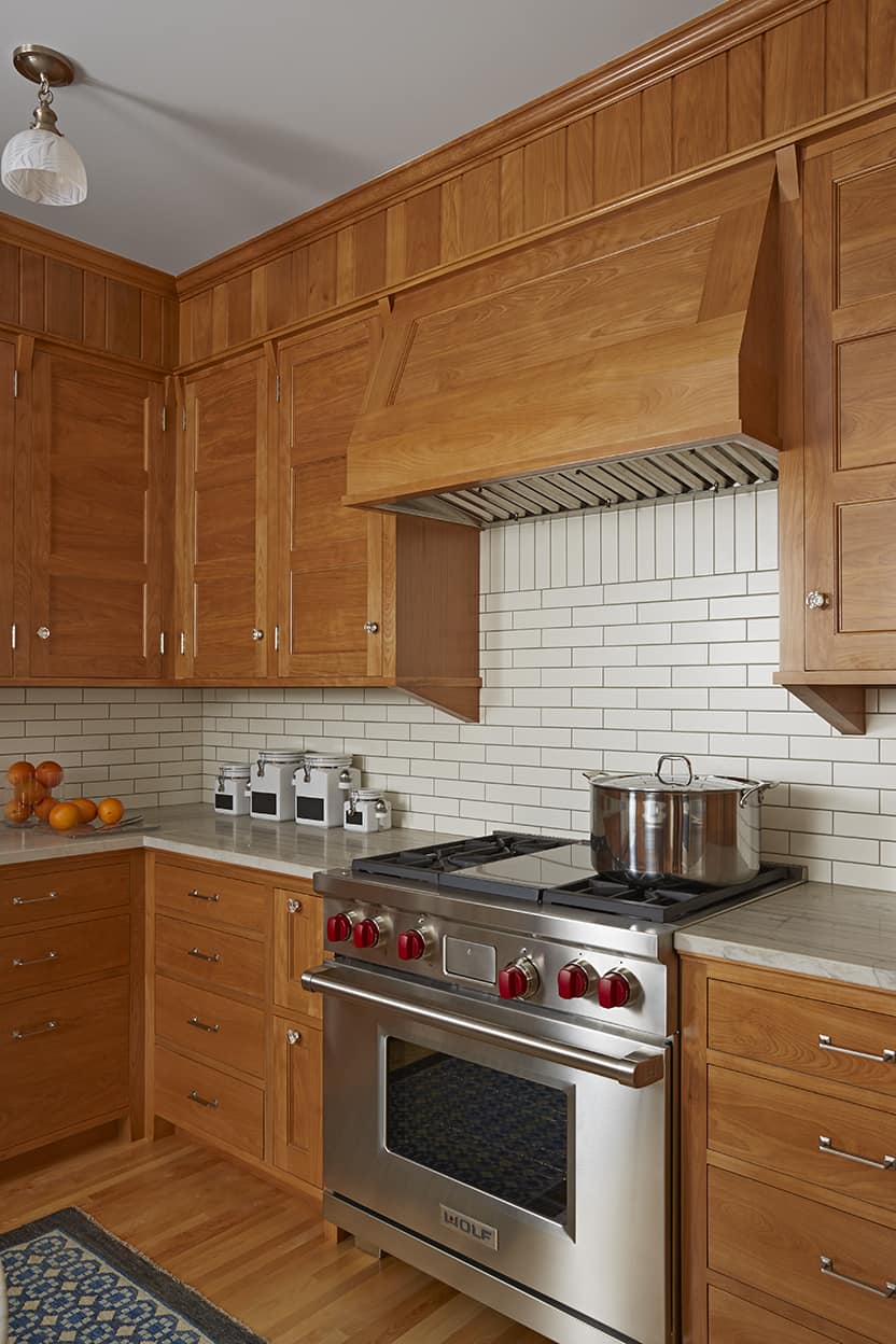
Built in 1907 for $5,500, the house was originally designed by noted architect Franklin Ellerbe, founder of Ellerbe & Company (later Ellerbe Becket). Passed from owner to owner, original drawings of the building presented an interesting dynamic to the design process. We had all the information necessary to rebuild the kitchen as it originally was, yet that wasn’t what we’d been asked to do. It did raise the question; just how and how far should we take things? For instance, we knew the original wood species of the back of house was red birch; this immediately became a part of the central design. How to manage the quantity of wood within the space became a challenge which we met by creating the stainless steel appliance alcove and the use of fresh and crisp light values for the stone tops and tile.
As a design professional, what were your top 2-3 design goals?
When one walks up to a house and places their hand of the front door knob, there’s an expectation of what lies beyond that door. Our goal was to deliver on this anticipation—a beautiful kitchen, newly defined but drawing on tradition and quality.
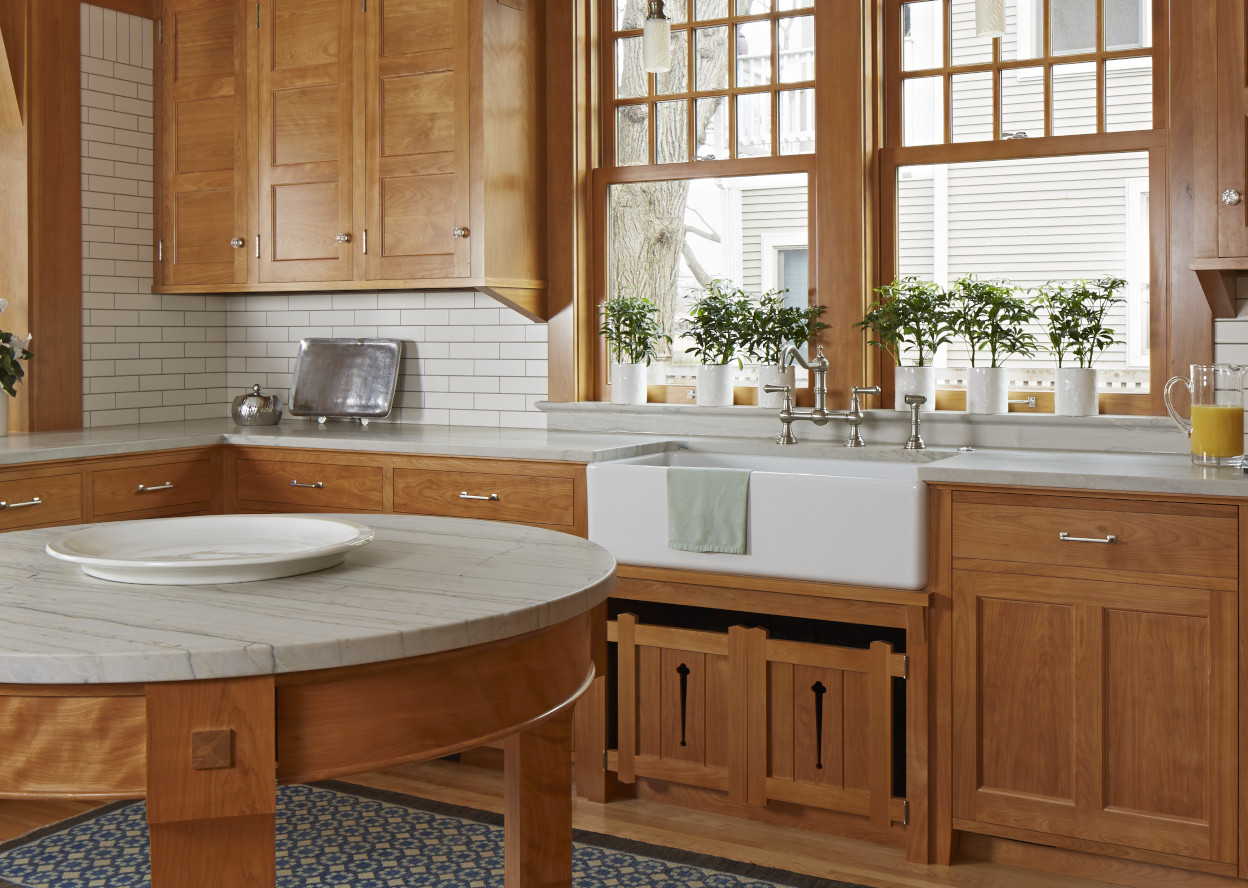
In tandem with the owners, we worked to create governing principles for the project helped them—and us—determine the balance of period detailing, materials and finishes with a fresher perspective and more youthful sensibility. We strived to create a wooden jewel box of a kitchen boasting period detailing and craftsmanship, with timeless and enduring design and modern function and comfort.
What makes this kitchen unique / award-winning?
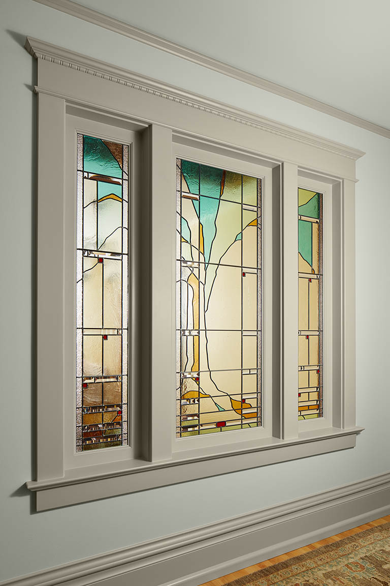
The use of historic detailing and precedent is honest; it’s real and accurate—not a caricature. From hardware to cabinetry details and joinery, this is all the way it used to be done. The lighting is a combination of restored antique and custom pieces which we designed. Art glass shades were blown for the project.
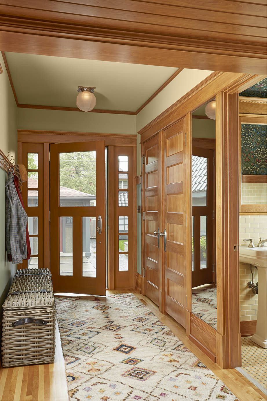
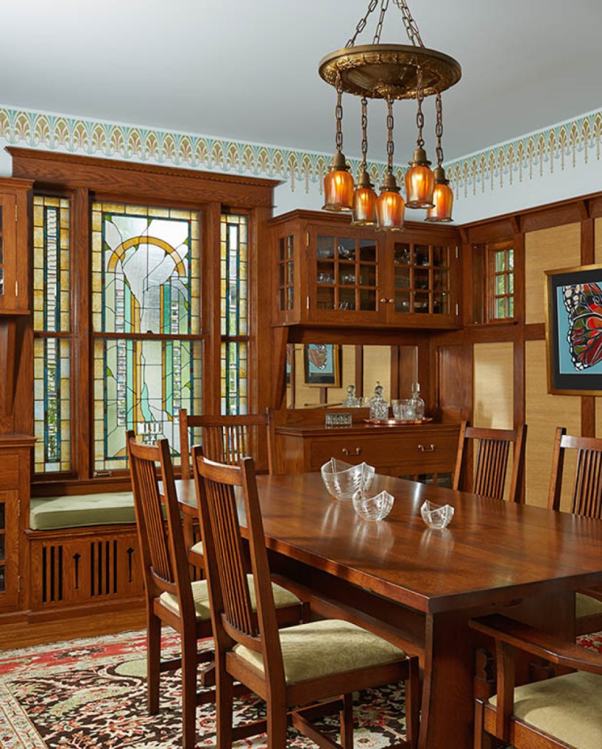
Birch is a wood species traditionally found kitchens of this vintage. Red birch has a richness and chatoyancy found in old growth lumber. The finish we’ve developed combines use of amber and garnet shellac with contemporary overcoating for stability and durability. A dark stained wood ceiling in the breakfast room connects to the feeling of the open front porch; note the decorative stenciling on the wood frieze.
While rooted in tradition, the design marries historic precedence with a contemporary kitchen and modern sensibilities. The work is respectful of the original house because it honors the spirit of 1907, while ensuring the viability of the house for years to come.
The kitchen in this beautiful project was the Global Winner of the Traditional Kitchen Award in the Sub-Zero & Wolf Kitchen Design Contest 2015-2016. Learn more about the project and see before pictures of the kitchen. Here’s a video about the kitchen. It also received two ASID First Place Awards, for Historic Preservation and Bathroom or Powder Room over 50sf. It also won the Hanley Wood Remodeling Design Merit Award – Kitchen Remodeling (>$100,000).
In 2018 this project also won the ASID Award First Place Kitchen 300-399 sq. ft., and was the Hanley Wood – Merit Winner: Whole-House Remodeling >$500,000.
In 2019 it won one of the Blend Award’s Renovation/Addition awards and its Best in Show, as well as being included in the Homes by Architects Tour.

Copyright 2025 David Heide Design Studio