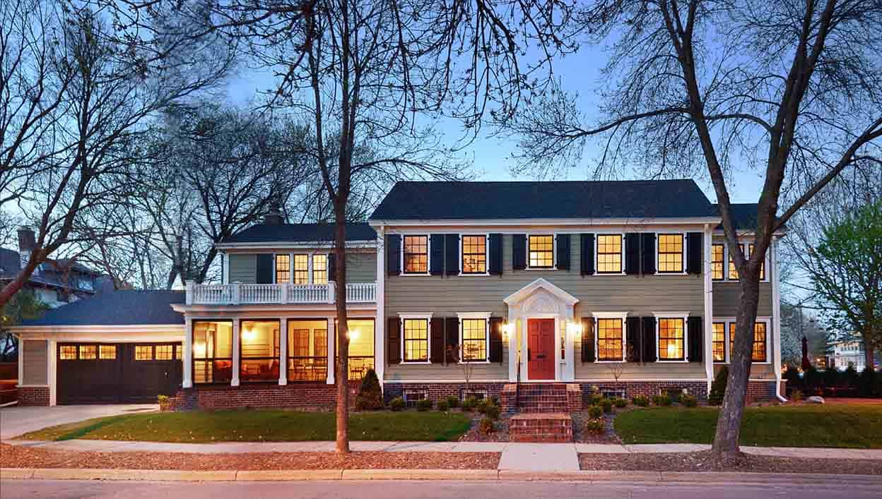
When comparing their house to their neighbors’, the homeowners realized their home did not live up to its potential. Envious of the beautiful residence across the street, they turned to us to help restore the original Federal Revival character of the house and create more outdoor living space.
BEFORE & AFTER Over time, remodels had chipped away at the historic charm of the residence. Our design restored the Federal Revival character of the original house across the entire façade, from roofing, siding, and shutters to millwork.
During previous remodeling projects, their house had gained a 2-story addition and attached garage on one end which did not relate to the vertical benchmarks of the original house. The 7-foot garage door was low and out of proportion to the rest of the house. Much of the original exterior detail, including the window casings, had been removed, and the original soffit and fascia moldings were covered with formed steel siding. A roof had also been added over the front stoop, covering the original lunette pediment above the door.
Our task was to unify the existing addition to the original house and recreate the Federal design vocabulary across the entire structure. We removed the existing steel siding to uncover the original millwork and features of the house, and identified existing windows that had been removed. The original lunette was exposed during the remodel, and we rebuilt the front entrance’s missing details. The paint scheme we selected is historically appropriate, with a warmer color on the body of the house together with white trim, a red door, and new fully operational black shutters—all characteristic features of the Federal style.
With only five feet of space between the house and property lines on the left and back of the lot, the homeowner’s desire for better outdoor living space meant the new screen porch needed to be added at the front of the house, rather than the back. We carefully considered its proportions to balance with the rest of the building and unify the vertical tensions between the original house and the addition. The millwork we designed is based on the building’s uncovered architectural details, and the screen provides a sense of privacy to the street. An additional at-grade terrace was built on the end overlooking the park.
With all-new siding, millwork, windows, shutters, roof, and front stoop, the house takes its rightful place among the other houses in the neighborhood. As the homeowner said, it looks “even better than the house across the street.”
For more about this project, visit the East Isles Federal Revival portfolio.

